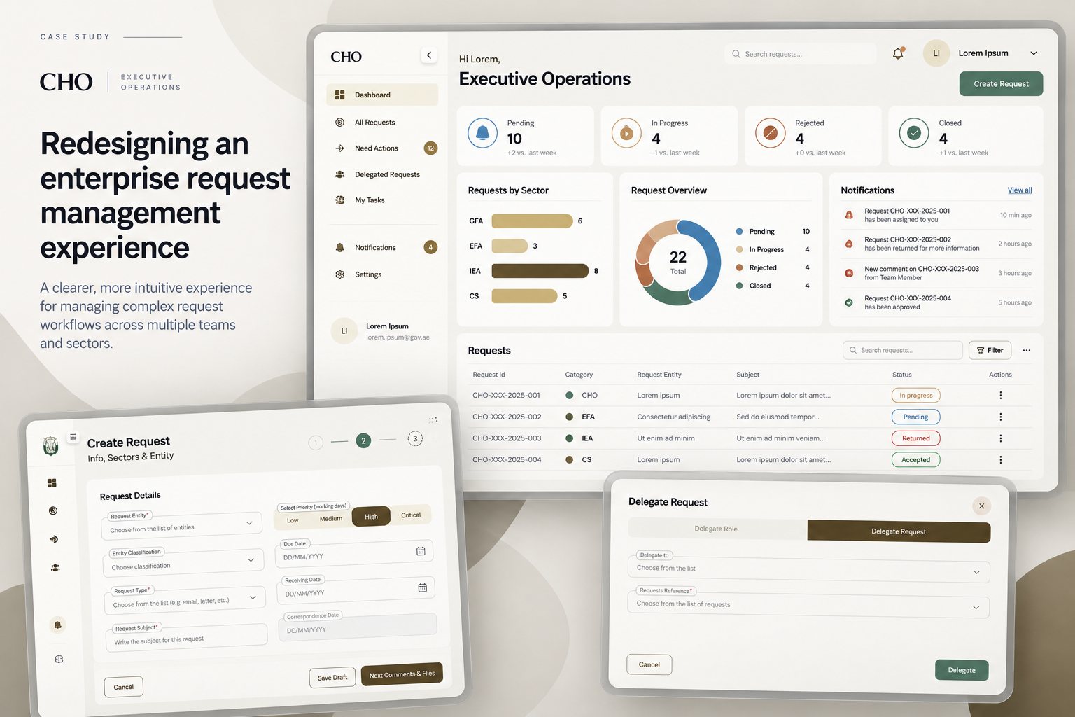
Too much product, said all at once.
The platform managed requests, approvals, confidential documents and administrative processes for roles across the organisation: people creating requests, administrators, and senior stakeholders reviewing, delegating and approving them.
Over time it had accumulated complexity. Dense forms, unclear statuses, inconsistent feedback and accessibility gaps meant people had to understand the system before they could use it. The amount of functionality wasn’t the problem. The way it was communicated was.
- 01Create and submit requests through complex, multi-step forms
- 02Upload and manage documents, some of them confidential
- 03Follow progress, review, approve and delegate
- 04Understand who did what, and see only what their role allows
Less cognitive load. The same capability.
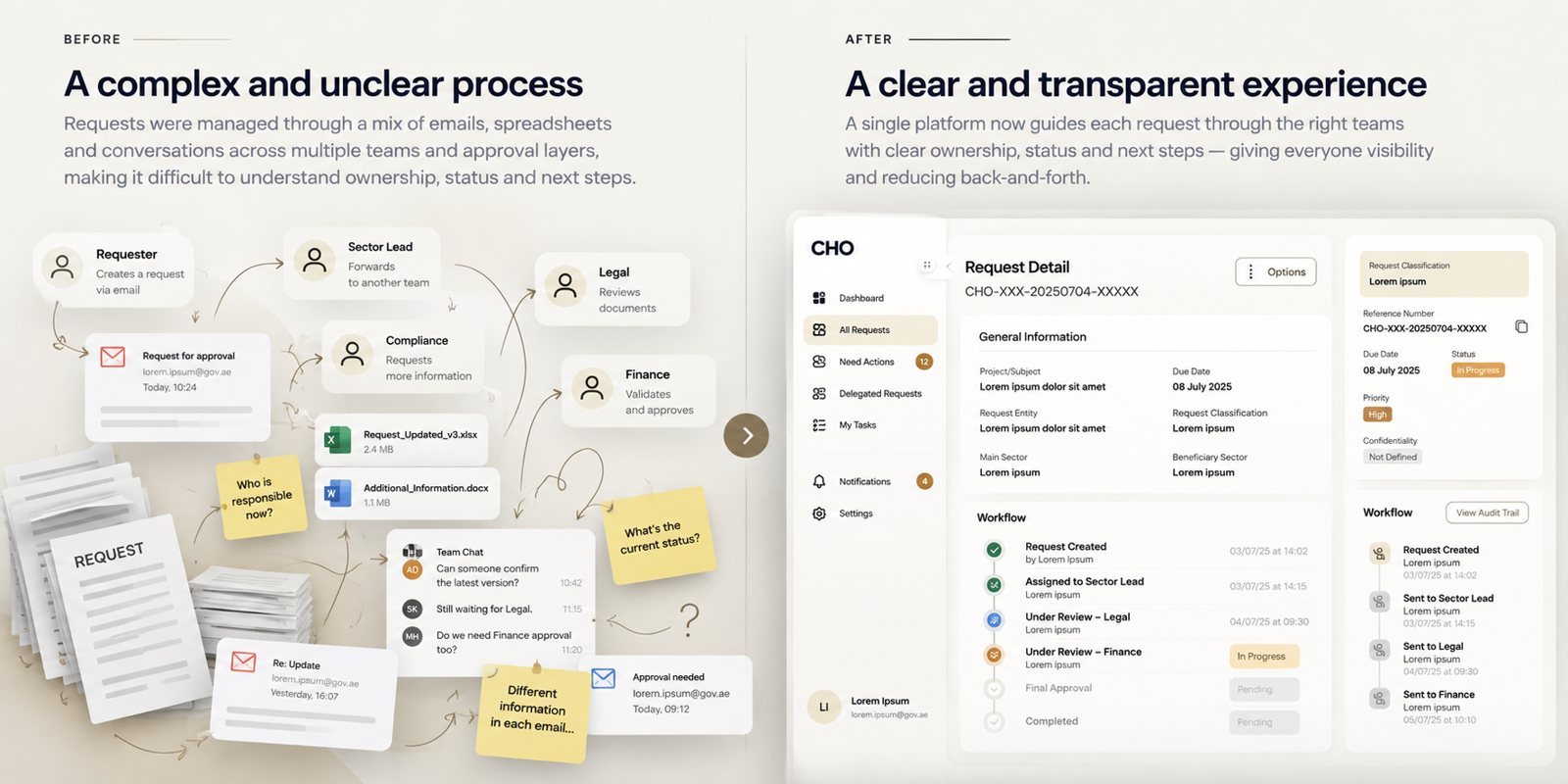
Before: emails, spreadsheets and chats across teams. After: one request with clear ownership, status and next step.
Five moves that reshaped it.
Screens use placeholder content. Real data and client details are confidential.
Looking at the system, not the screens.
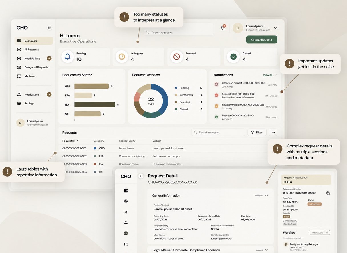
I analysed the experience as a set of connected journeys: request creation, request management, delegation and activity, documents, and dashboards. The same problems kept appearing: too many statuses to read at a glance, important updates lost in the noise, large repetitive tables, and request details with many sections of metadata.
Underneath sat six recurring issues: high cognitive load, ambiguous feedback, inconsistent statuses, accessibility gaps, complex forms and internal jargon.
Guiding question: what does this specific user need to understand, decide or do at this point in the journey?
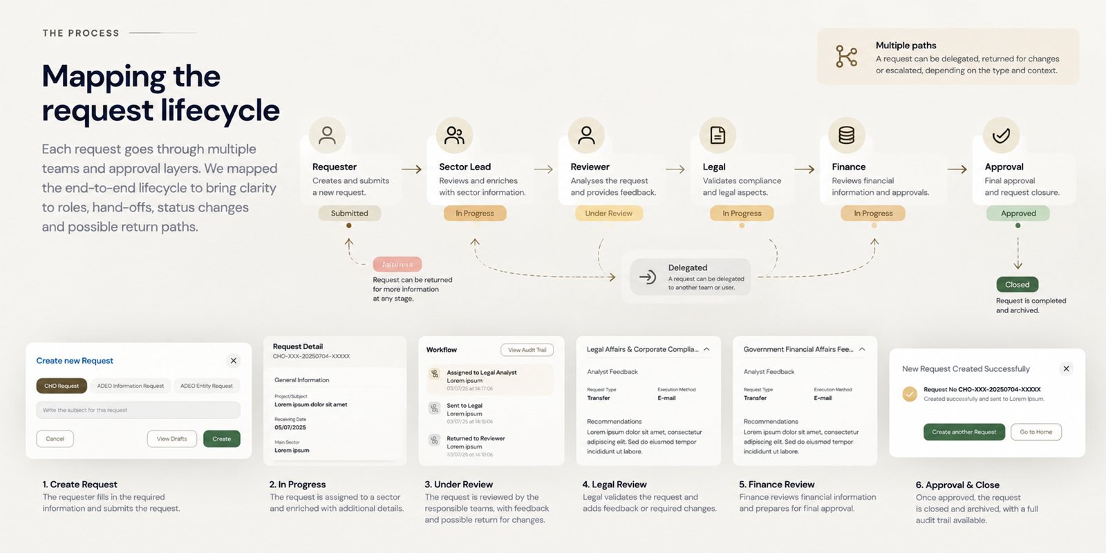
Mapping who touches a request, and when.
Each request passes through several teams: requester, sector lead, reviewer, legal, finance and final approval. I mapped the end-to-end lifecycle to make roles, hand-offs, status changes and return paths explicit.
Real requests don’t move in a straight line. They can be returned for more information at any stage, delegated to another team or person, or escalated. The map became the basis for the status language and the role-based views.
Decision: design for every path a request can take, not only the happy one.
Easier to understand, not just shorter.
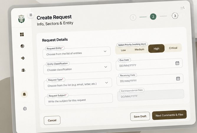
The multi-step flow was restructured into clear phases: information, validation, review and submission. Instead of giving every requirement equal weight, each step shows what is needed now.
Related fields are grouped, required fields are explicit, priority is a simple choice, and terms that couldn’t be simplified get a contextual explanation. Drafts can be saved, and cancelling is never ambiguous.
Principle: reduce cognitive load without hiding the complexity the business requires.
Context before action.
An approver isn’t entering data. They need to understand a request and decide. The request detail answers what it is, who submitted it, which documents support it, what already happened, and what changes after approving or rejecting. Activity became a readable workflow: who, did what, when, in which context.
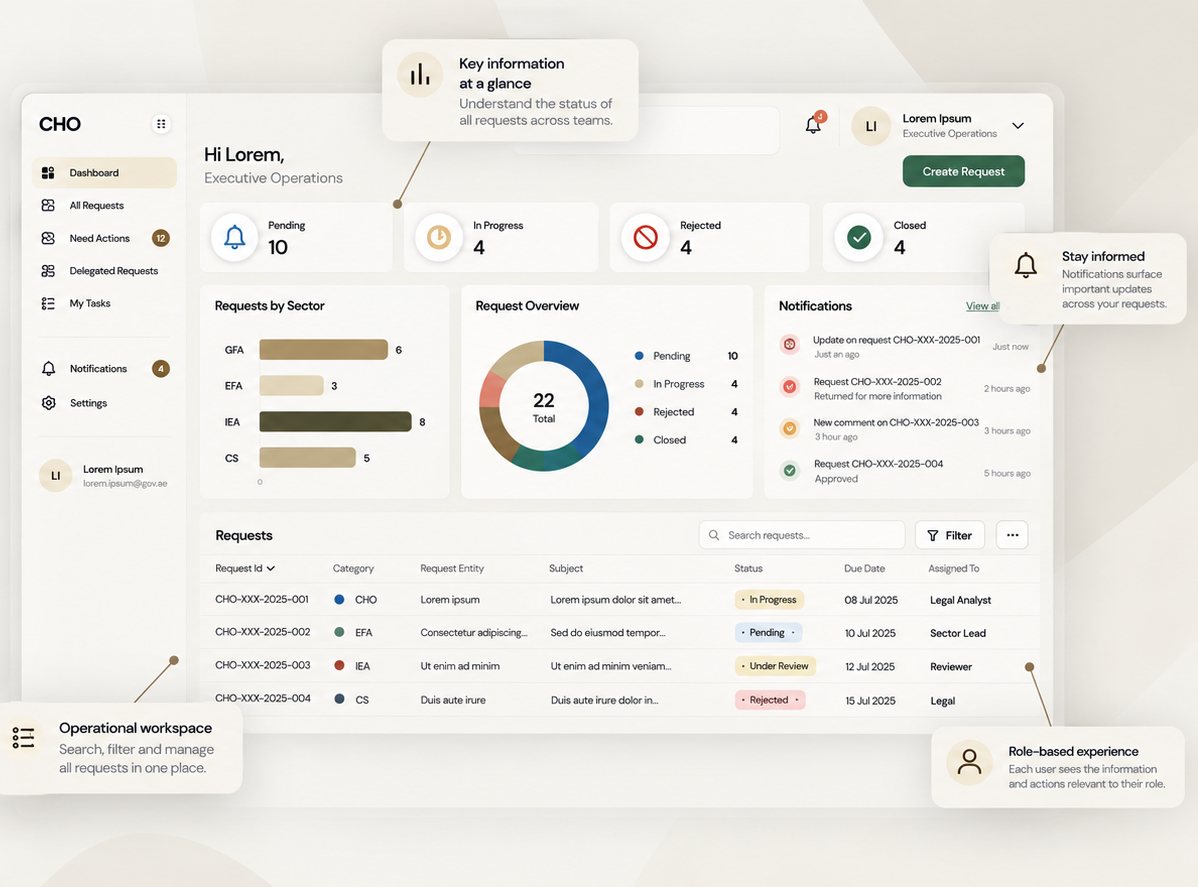
The dashboard turned into an operational workspace: key numbers at a glance, notifications that surface what changed, and a request table with status, due date and owner that people can search and filter. Each role sees the information and actions relevant to it.
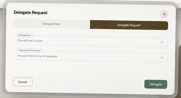
Decision: approve, reject and delegate are clearly separated from secondary actions, so a decision is never a misclick.
From screens to patterns.
I built a reusable UI foundation with development and delivery teams, designed to work with the platform’s implementation model: forms, tables, statuses, notifications, modals, document interactions, and empty, loading, error and success states.
Accessibility was part of it from the start: clear labels, visible focus, sufficient contrast, explicit validation, and states that never rely on colour alone. As team lead I reviewed work and helped other designers use one shared language.
The shift for the team: from “how should we design this screen?” to “what pattern should the product use whenever this problem occurs?”
A coherent, scalable product experience.
The project set a clearer UX direction for a complex process-management platform, and a foundation for future product development.
- 01Complex workflows structured into clearer journeys
- 02System states communicated consistently
- 03Key accessibility issues addressed
- 04Clearer request and approval experiences
- 05Visible activity and ownership
- 06Reusable UI patterns across the product
Quantitative metrics and identifiable client information can’t be disclosed because of confidentiality restrictions.
Learnings & next steps
Make complexity understandable, not simple.
- 01Enterprise UX is mostly managing complexity. Rarely is functionality missing. The work is deciding what people see, when, and with how much context.
- 02Consistency is a UX feature. When interactions behave predictably, people spend less effort learning the interface.
- 03Accessibility improves it for everyone. Clearer hierarchy, feedback and focus states help every user, not only those with accessibility needs.
- 04Systems beat screens. The strongest solutions were patterns that solved the same problem across many journeys.
Exploring a similar idea in your service or organisation?
Whether it’s an approval process nobody understands, an enterprise tool that grew too complex, or a design system to bring a team together, we can start with a conversation.
Nuno Flórido is a UX/UI Designer and Design Team Lead at S4 Digital, based in Setúbal, with experience in digital transformation projects across the public and private sectors internationally. He works with AI and user experience methods from discovery onwards: defining the problem to solve and closing one solution at a time.